Friday, December 23, 2011

Holiday Greetings!

Happy Christmas Eve Eve, all!

I know I've been absent from this blog for nearly two months. In my defense, a lot of things have been going on to prevent me from updating regularly. One of them being, I got a job. It's not an art job, unfortunately, but it is paying the bills, which is mostly what matters right now. I can still do art outside of work, which I have been doing.

This year, I designed Christmas cards for both my family and for my aunt. I thought I'd show them now. It may be a little too late to purchase them, but they are for sale in my online shop ...in case you want to get a head start for next year.

This is our family Christmas card this year, designed according to my mom's specifications:

front:
inside:

And the one I designed for my aunt, it's a bit of a different style. She wanted a sense of movement and something involving birds.

front:
inside:

Anyway, I hope anyone reading this enjoys the art and has a wonderful holiday and a very healthy and happy New Year!

<3 Emily

Wednesday, November 2, 2011

And it's finished!

So, I don't know why I haven't updated lately, but I finished the four-piece flower set I was doing for my aunt about two weeks ago. I guess I have had a few things going on since then that have prevented me from posting it on here, but here is the final piece finished:

 Those are Cornflowers, which before I did some research on, I knew very little about. They are actually really pretty blue and purple flowers. I gave all four paintings to my aunt a couple weeks ago and she was really pleased with them. I was so glad. I held them up against the wall in her living room and they coordinate with the room's color scheme very well. I had been keeping that in mind the whole time I was doing this project. I am also happy with this set. I would gladly hang them on my own wall, but I'm especially happy that my aunt liked them.

I also have been just working on random little paintings here and there. Sometimes I just get the urge to doodle, and with that, comes the urge to paint that doodle. It usually happens late at night too, like as my eyelids are starting to droop and I'm yawning every five seconds. That is just how my mind works, I guess. So I thought I'd just show you some of these little doodles.

 I actually did this because I wanted a new icon/profile picture for some websites I am on, like twitter, facebook, tumblr. So far, I've only put it as my twitter icon. I wanted a look to my twitter account that was completely done by me. So this is me in a nutshell, surrounded by some of my favorite things as cute little icons--a starfish (for my love of the ocean and the beauty of the sea), a teacup (do I need to explain this one?), a heart (because I follow my heart, not my head, usually), a bunny (because I love cute animals), a poppy (my favorite flower) and nail polish (because I like to paint my nails). It's a more cartoon-y, cute drawing of me. I am not that cute, but I think it still looks like me because of my purple glasses, scarf and of course a cardigan. I also, am exploring the idea of my own handwritten font/logo. Whenever I hand-write things, they always end up in this sort of style.

two more logo designs with a tea theme...which leads to the next set of doodles...


Guess what. These are actually painted using tea! Go ahead and call me crazy, though I really don't think it is that insane. I am definitely not the first person ever to paint with tea. And it is actually not the first time I, myself, have ever painted with tea. When I used to work on school projects in Grade School and Middle school and it required an aged look to the paper or something, we used tea to do that. Tea staining gives an antique look. I used that same idea here. But I wanted to be literal about it. I drew some little teacups (each with their own unique pattern and shape), then used hot tea to do a wash over them, then added watercolor. I used Earl Grey and Green Tea. The Earl Grey, being a black tea, gave a darker wash to the paper, while the Green was a lighter, more yellow-toned color.

I actually used the teacups as my twitter background. I like how it came out. I think I will be doing more tea paintings in the future.

Wednesday, October 12, 2011

Two more finished!

For the past month or so, I've been working on this series of four pieces for my aunt. So far I've finished three and am currently working on the fourth one. Just wanted to show the two newest ones to you all.

 Hibiscus - I really like how this turned out. As I am painting these, I am noticing that I go through many stages of how I feel about piece. I start out hopeful that it will turn out nice. Then I become frustrated that it doesn't look good and I don't like it. And then eventually I grow to love it. When I was working on this piece, the hibiscus flowers were my main source of frustration. Flowers are difficult to paint. I think it's because they are so delicate, you want to say as much as you can without making it look too heavy. The good thing about the style I work in, is that I'm not going for realism. I'm going for a likeness, but in a breezy, illustrative way.

Queen Anne's Lace - I became super frustrated with this piece. When I first started painting the stalks, I guess you could call them, they looked like palm trees on a beach in the sunset. Not what I was going for. The purple-y part you see at the top was perhaps a bit too pink at the time and it just looked very tropical. I was going for more of a starry, country meadow look. I suppose the orange frisket I was using (I will get to that later) for the "lace" part of the flower didn't really help. Queen Anne's Lace isn't your typical flower. When most people think of flowers, they think of petals, not little white, furry, bumpy things on the tops of stems. Not to say that this isn't a beautiful flower, but it is an unconventional one. I decided to just go with a speckled white look which makes it look like a cluster of white on top on the stem. While I was painting over the little frisket dots, I decided I needed more of them, so I went through again, over painted paper and made more dots. That is actually the first time I've ever added frisket over paint--surprisingly. I was hoping it would add some depth. I think it helped.

I showed the pieces so far to my aunt last weekend and she really liked them, so I'm excited to see them hanging in her living room soon!

Oh, and the frisket! I finally found a frisket that I love! I had been using Utrecht brand masking fluid for the longest time (which I really didn't like) and I have no idea why I didn't go buy new frisket. Well, when I was downtown a couple weeks ago, I went to Blick and asked one of the employees what she recommended for frisket. She pointed out the Blick Liquid Frisket in the little jar.
 The great thing about this is it is actually liquid-y! My other stuff was all gummy and really difficult to use. This glides on the paper like I'm using paint. It's great. And I like the orange color much more than that ugly yellow. It's easier to see on white paper and under paint.

Monday, September 26, 2011

The Delphiniums finished...now onto the next one

As you know, I am working on a four-piece set of paintings of different flowers for my aunt. The last time I posted, the first one was a work-in-progress. Well, I'm glad to say that it's now finished...

I tried to stay true to my style. I kept it pretty organic and natural this time (as the subject matter is flowers) and I didn't even tape off the edges of the paper, like I normally do. I decided to just stick with a hand drawn edge. I showed this piece to my aunt last week while it was still a work in progress and she was very happy with how it was coming along. I was relieved to hear that because I was just about ready to scrap it and start over. Personally, I love this piece. Blues and purples are colors I love painting with (because they are my favorite colors) and how can you get more light-hearted and ethereal than flowers? Love it! I'm proud of this.

The next piece in the set that I am working on is of Hibiscus flowers, which are another of my aunt's favorites.
 It's coming along. As you can see, it is far from being finished. I plan on working on it a little more today. But right here is two days work (and I don't mean a full 24-hour day, obviously). But I'm keeping with the natural whimsy of it. I'm using frisket again because I like the effect it gave the first piece. I'm trying to stick with the same color scheme (underlying blues, purples, pinks, and teals) as well so all the pieces go together. For this piece I added a hummingbird. My aunt loves hummingbirds. She has a feeder on her back porch and she enjoys watching the hummingbirds come to visit. They are fascinating little creatures. This little guy is going to be a red-throated hummingbird, which are the kind that live around this area of the country. Apparently, there are different ones that live west of the Mississippi river.

Thursday, September 8, 2011

Updates!

So the Sons of Turner premiere exhibition was a hit, I am glad to say. Unfortunately, I could not stay the entire evening, but while I was there, we had a lot of visitors, which was great. My parents really enjoyed the show as well. I was glad to be a part of it. I believe the show is going to stay up the remainder of the month, so head out to the Ontarioville Art Center in Hanover Park if you're interested.

me with my artwork

Also, today, I started working on a commission I'm doing for my aunt. She wants four paintings of delphinium and hibiscus flowers to hang in her living room. It was nice painting today because I haven't really flexed my painting muscles in a few weeks...which is awful. I had been temping at my old job for a couple of weeks (which was also great) but it didn't give me a lot of time or energy to work on art. Now that I've got nothing but time, it's the perfect thing. 

I started the first small painting of delphiniums today. It's turning out a lot like an illustration, but I am happy with it so far.

It's quite whimsical (I use that word WAY too much), but I like it. It's really up to what my aunt wants, though. And this is a work in progress. The yellow you see on there is frisket (masking fluid). Ahh, my old friend frisket. Actually, we never really were friends. It's always so clumpy and it completely ruins my brushes. No! I do not use my quality brushes, but even the cruddy brushes I use become more cruddy when frisket is added. Note to self: find better frisket. I'm currently using Utrecht brand that I purchased for my Watercolor I class two years ago. Maybe that is is why it's so clumpy? If anyone has any suggestions as to a better brand of frisket, do let me know!

Also I'm working on a Fluid Watercolor block that I bought at Blick the last time I was downtown. Unfortunately I do not have the kind of money at the moment to be buying expensive Arches blocks, so I thought this would be a good alternative, since a friend of mine recommended them. It's cold press, and I am now a hot press girl, but I don't mind cold press every now and then (that was all they had anyway). The paper is taking the paint well, and I tend to do a lot of wet-in-wet stuff, except the corner is starting to lift up.
Fluid blocks don't have glue all the way around the block like Arches ones do. They are just glued on two sides. I just thought this was kind of annoying. As long as it doesn't come detached all the way around, it should be ok. I guess I'm not going to be working on this for hours anyway. But that's just my little gripe. Otherwise, it's a great block.

Monday, August 29, 2011

Away From Home : The Sons of Turner Premiere Exhibition

This Saturday, September 3rd, at the Ontarioville Art Center the Sons of Turner will be exhibiting works from our annual trips that we take around the country. There will be pieces from Santa Fe, NM, Savannah GA, and the Midcoastal region of Maine. 

This is my first REAL art show, so I'm really excited! I'm also excited to see what everyone else has done. We have a lot of talent between us all as a group. 

I have one piece in the show, my Barn & Buoys piece that I painted from a photograph I took at North Creek Farm in Phippsburg, ME. I hope people can make it out and see what we, as the Sons of Turner are all about. Hope to see you there!


Wednesday, August 3, 2011

Books, Bunnies and Artist's Block

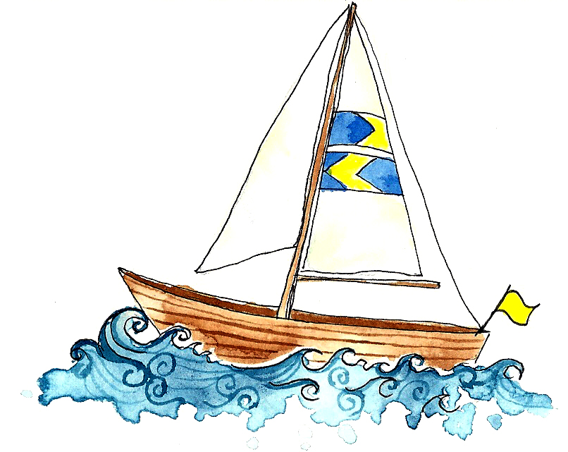
This week, I've been trying to break through my artist's block. It happens sometimes, every once in a while. I just can't think of anything I want to paint or draw. I have to basically force myself to do stuff--which isn't always the best thing. For some reason, I just haven't been able to find interesting things to work on or things that inspire me. So I turned to things that I know, just common objects.

So this summer, I've been trying to read most (if not all) of the remaining Jane Austen books that I haven't already read. I read Pride & Prejudice partially in High School and finished reading it afterwards, when I realized how great it was. Then last Autumn, I found Sense & Sensibility and Persuasion grouped together in a book at Borders (when it was still in business) for $4.99...and beautifully bound too. I read Sense & Sensibility and have yet to read Persuasion. Last month I polished off Emma and now I'm currently reading Mansfield Park. You might wonder where I am going with this...well, I decided to start doing more illustrations of just things that I like and are part of my life...along with the blind contour teapots.
You would be surprised how much people like these kinds of simple drawings. I put this up on tumblr and the last time I checked, it had nearly 100 notes. I try to make them simple. I want them to look like they were drawn, not like a photograph and not like a computer generated image. They're doodles. They're very whimsical and almost haphazard, which I think adds to their charm. If I wanted to draw a realistic representation of a book, I could, but, these sorts of things are so much more personal and I like that about them. And they are meant to be personal because they are my things, but also things that other people could appreciate. And no, I haven't forgotten Northhanger Abbey. I don't own that one yet.

I also experimented with something quite different yesterday. I was thinking about bunnies. I really love bunnies. I think lately, they have become my favorite animal. When I think about it, it makes sense. I was born in the Year of the Rabbit in Chinese Astrology--kind of a coincidence. So I wanted to draw some bunnies to use on items in my online shop. I haven't really drawn that many animals in the past, but an idea just kind of came to me out of the blue and I just went with it. But I wanted to work with it digitally instead of using paint, so it would be more changeable in the future. I started with a drawings of a  simple cute little bunny in a sweater (because what could be more adorable?)...

and added spots and accessories digitally...
I could change the color of the sweater, I could change the spots, and I could change whatever I wanted in Photoshop. Plus the texture of an actual knit sweater is fun. I can even make patterns.

This is really just the beginning. I do plan to do more bunnies, but I can also do other things. Right now, these bunnies are adorning baby clothes in my online shop, but I think that they would make great little trademarks for myself, considering how much I can change them. They could be put on Christmas cards and other holiday-related items (which I do plan on working on soon). I think if I changed the colors on them too, they could be a bit more sophisticated.

I still love watercolor, but this is a fun way to work as well and I like how versatile it is. Tell me what you all think.

Friday, July 29, 2011

Sons of Turner Figure Painting Session

On Monday, I went downtown for the first time in two months to do some figure paintings with a few of the other Sons of Turner at MBK Studios. It was really nice to be in Chicago again and see people that I haven't seen in a while, and it was fun getting to paint the figure. I haven't done a lot of figure painting--or figure drawing, for that matter in a long time, but it was a nice change from teapots and cupcakes.

I think I was a little rusty. Getting rusty is never a good thing. But I guess when you paint something that you haven't painted in a while, that happens. Ever since I started working in a looser style, I haven't been painting figures, and so trying to use that style to paint the figure was difficult for me. There was a time when all I drew were people, I still like to draw people, but lately I've been looking at inanimate objects.

My gestures were okay. Certainly not my best, but not my worst either. I started out with paint, then decided I should try just using pencil to get the forms correct. They were more like studies than anything. I guess that's what gestures are anyway.

For the longer paintings, I started out not using micron pens to see if I could get a more fuzzy look.
  This one got a little muddy. I was painting too much, which is what I have been trying to get away from. Still, there are some things that I do like about this painting. I like that I was, for the most part, able to achieve a likeness of his plaid shirt without getting too detailed, I also think some of the shading on the face looks alright. But the pose is a little awkward...how I drew it. The right arm looks strange and the right foot needs a lot of work. But This was sort of a warm-up. This isn't just my typical way of painting.

My second one was a lot better, in my opinion.
 Maybe it was more successful because of the fact that it is a female form. I am just better at drawing women. I do think I have come a long way just in the past couple of years, though. I used to not be able to draw men at all, but now, I definitely can, I just prefer to draw women. But I like this one, also because I stuck with what I know and that is lightly sketching in pencil, then adding micron pen, then using washes of watercolor. I don't think I over-painted this one. It was difficult because the color of her sweater was an unusual color to mix. I don't even remember exactly what colors I used--probably burnt umber, indigo, maybe even a little but of brilliant purple (yes. purple!) But I definitely think this was my most successful piece of the day.

All in all, it was a good day. I hope the Sons can get together again soon for another painting session.

Friday, July 22, 2011

Rocky Pemaquid

The past couple of days, I worked on an illustration based on one of my Maine photos. It was a photo that I took at Pemaquid Point Lighthouse in Bristol, Maine.


I actually don't think that the best part of the image is the lighthouse, I think the rocks are pretty cool. Those were some interesting rocks. Pemaquid Point has this big rocky area that juts out into the Atlantic ocean. It was really jagged and crazy looking. I honestly felt like I was on another planet when I was walking around on it. The rock was really gorgeous, though. It had strips of rust colored rock running through it. The layers were really visible. It wasn't like too many of the rocks you see around the Midwest portion of the country.
 

So I wanted to do an illustration that focused on the rock...and taking a little inspiration from the work of David Scheirer that I was talking about in my last post. I wanted it to have outlines and simple washes. That's another thing. I've been really not liking my washes lately. Either, they're not exciting in any way, or they've got too much going on. Maybe that's just the perfectionist in me talking.

Obviously, I took a few artistic liberties with this. I made the weather a little nicer than it actually was. But hey, that's one of the joys of being an artist. It still looks like what it was. I tried working some brighter colors into it because that is a characteristic of my style. I used a lot of purple and teal in the rock, especially. Painting rock is always fun, but this was a lot of fun. I have to say that the stripy-ness of the rocks is not realistic at all, but that was the point. I wanted to convey a feeling, more than a photographic image. I am happy with the wash I used in the sky as well. My scanner isn't wonderful, so it does wash a few things out (even with me editing them afterwards), so it looks better on the actual piece.

All in all, I am happy with this. I wanted it to be simplistic and colorful. Not sure if I would add anything else to it.

Wednesday, July 20, 2011

Artist Inspiration of the Day

Tumblr is wonderful. Tumblr is just the greatest!

I discover a lot of neat art and artists on Tumblr and I found one today that I thought I'd share: David Scheirer.

have you ever seen anything cuter than those puffins?


This is his website:
http://www.studiotuesday.com/index.html

It looks like he works mainly in watercolor and he has a more traditional rendered style, as well as a whimsical illustrative style, which I am more fond of. His illustrations are just so cute. He's got me all inspired to paint more ocean-y things! Check out his Etsy shop too!

Edit: I just was looking at his blog and it seems he just recently took a trip to Maine! Hence the puffins! I unfortunately, did not see a single puffin while I was there. That's kind of a neat coincidence, though.

Thursday, July 14, 2011

Some Doodles

I finished the ship in a bottle illustration the other day. I'm quite happy with how it turned out. I'd like to maybe illustrate a few more ships in bottles--ones of all different shapes and sizes. It's like I'm creating my own illustrated collection of eccentric little doo-dads.

 Yesterday and today, I've been working on some other random illustrations of doors. "Why doors?", you ask. Well they're not just any old doors. They're somewhat fancy doors, like you would find on a townhouse. Each door is unique and painted a different color. It's like a reflection of the person that lives behind it.

These doors are also making up a collection of unique little illustrations that I'd like to continue with. As for now, I plan on putting them on some items in my online shop!

Speaking of the shop, I'll show off some more of the doodles I have done to put on products, since I haven't really shown them anywhere else.

 Oh look, another sail boat. I have been in such a nautical state of mind lately. I blame Summer and Maine. Not that it's a bad thing.

 Cupcakes are another recurring theme. I don't seem to mind.


This watering can was actually done because I thought up the idea for a greeting card first, but it stands strong on it's own.

Balloon Girl. She looks so Parisian. One of my friends visited Paris this summer and looking at her photos, I think I got into a Paris frame of mind.

I named her "Welly Umbrelly" (and I will trademark that if I have to) because she's wearing Wellies (Wellington Boots) and is carrying an umbrella. I just wanted a sweet, Springy character.

Saturday, July 9, 2011

Ship in a Bottle

I've long been fascinated by ships in bottles. I really would like to own at least one someday. I guess it's kind of strange that I like things that are nautical and aquatic in nature when I haven't really spent that much time around boats or oceans. In fact, it took me 23 years to see the ocean for the first time ever, but I still love it. The ocean is just filled with so much mystery and beauty. I think that's what attracts me to it.

When I was in Maine, we visited the Maine Maritime Museum in Bath. As one would assume, they had a bunch of ship-building artifacts and nautical things in the display cases, but the things that caught my eye were the ships in bottles. I don't know if I would ever have the patience to build one of these, but I did want to illustrate one.

 This is probably an antique, so I doubt I could ever afford it, but isn't it great. I think ships in bottles are so whimsical. There's that word again. I like the fact that they are small representations of a big thing. I just think they're really special.

 Obviously it's not painted yet. But I like to scan things before I paint them in case it turns out horrible. I'm not thinking that it will, but since I've been working in a looser style, that does happen sometimes. But with this illustration, I tried to make the object come to life more. I played around with the more animated, curly waves and added variations and breaks in the line of the ink. I think I have made the object more my own by doing this.

Also, I'm trying to practice drawing ships and boats. I want it to still look like a ship without being so detailed that you have to use a magnifying glass to see all the little things on it. I mistakenly did not draw or paint any ships while in Maine, so looking back at my photos has helped.

I'll post another update after I add the paint to this piece.

Tuesday, July 5, 2011

The Mad Tea Party

I guess that's what it sort of was like this afternoon as I was painting these.

My wonderful friend Danielle Romero bought me this antique silver tea set at a goodwill store (I paid her back for it) a couple months ago and it has been sitting on display in my bedroom since. As many of you know, I collect teapots. This is like the crowning jewel in my collection. The tea set came with the teapot, the pitcher, a sugar bowl, and a creamer. I would never use it because I have no idea where it has been, but I knew that I was going to paint it. This was the first time I attempted to paint it.

 This is the teapot from the set. It has all these really intricate floral details on the spout, handle and legs.


Also, it's really hard to see in these pictures, but the silver has this sort of blue-ish, patina finish to it. It's like oil and water mixing. So gorgeous!

So I decided that the teapot's first posing-session would be for a blind contour. So I doodled away, not looking down at my paper and I was pleasantly surprised to find something cool.


Of course it didn't have the paint on it then, but I was so pleased! Then I added the paint. I was trying to capture the surface of  the silver. It was tougher than I thought it would be, but I think I captured it well. There is this really strong cobalt blue glow that the silver gives off. At first I thought it was the light from my bedroom and window, but it was the patina on the silver. It's really magical. And some parts of the silver have a rusty color to them, while others are deep purple, almost black! Like I said, this is the crown jewel of my teapot collection. Oh, the hidden treasures (sometimes not so hidden) at goodwill stores!

So I had so much fun painting the silver teapot that I wanted to try another blind contour of one of my other teapots.

 This one was decidedly less-successful than the other. I think because this teapot (which, by the way, is a teapot and teacup all in one) has a floral design printed on it, it was more difficult to capture it in a simplistic or abstract way. I need more practice with this type of thing, though, so it was good to paint it.

I have lots of other teapots, so I think I'm going to try doing a blind contour "portrait" of each of them. Each one is different...so I think it will make quite a series.

Also, I added some items (including prints) with the silver teapot on them to my online shop ! Please visit!

Wednesday, June 22, 2011

New Stuff!

I updated my online shop today with lots of new products!

Take a look at some of the new goodies...

 I've got a few prints/posters up including a couple featuring the Time Teapot!
Added some new items to the "Drinkware" section as well, including some glasses and mugs...

 Magenta Swirl Silhouette Glass


Blue/Brown Silhouette Mug

There are also a few new bags.

 Rapunzel Tote Bag

 Seashell Beach Tote (in Navy)

and that's only the beginning! I've got LOTS more at the store and cards are coming soon!!


Monday, June 20, 2011

Angry Bird

No relation to the ones from the popular iTunes game. This is a seagull from Camden, Maine.


It's sort of an illustration, I suppose. I used watercolor and ink. I tried to be really washy with the paint. I didn't want a really rendered look, but I still wanted it to look like a seagull. I'm also experimenting with using spatter in my work. Not sure if it really works here or not. I'm not displeased with this piece, though. I don't think it's my best, but if it had not been misting while I was there (and of course if the seagull had sat still long enough), this is how I would have wanted to paint him.

 I took a picture of a seagull at the harbor in Camden when my friends and I were hanging around the dock. He didn't even flinch when I got close to him. He posed for a few pictures, then majestically flew away to go sit by the nearby waterfall. 


Seagulls just look angry all the time. They are sort of mean birds, I guess. They steal each others food and sometimes people's food. I think one of the dinner table conversations we had on the trip was about seagulls and how evil they were. But you never know, this little guy may have been happy as a clam and here we all are judging him, just because he looks like he's got a furrowed brow. 

I suppose, in a way, I can relate to a seagull. Sometimes, when I'm just sitting there, people will say "What's wrong? Why so sad". That's my neutral face. I guess my neutral face reads as "upset", much like a seagull.