Wednesday, June 22, 2011

New Stuff!

I updated my online shop today with lots of new products!

Take a look at some of the new goodies...

 I've got a few prints/posters up including a couple featuring the Time Teapot!
Added some new items to the "Drinkware" section as well, including some glasses and mugs...

 Magenta Swirl Silhouette Glass


Blue/Brown Silhouette Mug

There are also a few new bags.

 Rapunzel Tote Bag

 Seashell Beach Tote (in Navy)

and that's only the beginning! I've got LOTS more at the store and cards are coming soon!!


Monday, June 20, 2011

Angry Bird

No relation to the ones from the popular iTunes game. This is a seagull from Camden, Maine.


It's sort of an illustration, I suppose. I used watercolor and ink. I tried to be really washy with the paint. I didn't want a really rendered look, but I still wanted it to look like a seagull. I'm also experimenting with using spatter in my work. Not sure if it really works here or not. I'm not displeased with this piece, though. I don't think it's my best, but if it had not been misting while I was there (and of course if the seagull had sat still long enough), this is how I would have wanted to paint him.

 I took a picture of a seagull at the harbor in Camden when my friends and I were hanging around the dock. He didn't even flinch when I got close to him. He posed for a few pictures, then majestically flew away to go sit by the nearby waterfall. 


Seagulls just look angry all the time. They are sort of mean birds, I guess. They steal each others food and sometimes people's food. I think one of the dinner table conversations we had on the trip was about seagulls and how evil they were. But you never know, this little guy may have been happy as a clam and here we all are judging him, just because he looks like he's got a furrowed brow. 

I suppose, in a way, I can relate to a seagull. Sometimes, when I'm just sitting there, people will say "What's wrong? Why so sad". That's my neutral face. I guess my neutral face reads as "upset", much like a seagull. 

Wednesday, June 15, 2011

Pyramid of Done-ness time!

Did some more painting on The North Creek Farm Barn painting today. I believe it is very close to being finished, if not finished. Like I said before, I don't want to over paint it. Tell me what you guys think!


And I am willing to add things and make changes to this (though, keep in mind, I can't erase very easily as it is done in watercolor). I want this to be a really great piece. I plan on entering it in the Sons of Turner Premier exhibition in September.

Thursday, June 9, 2011

The Barn Take Two - WIP

I've been working more on the painting of the barn in Maine. Just thought I'd let you all take a peek at it.

just ink

...and with paint...
It's coming along nicely. I just have to remember not to over-paint it. Sometimes I just don't know when to say when. The doors have been a bit of a challenge in that aspect. But they are looking ok now. It still needs a lot of contrast and maybe more spontaneous elements like splatter.

Tuesday, June 7, 2011

Works from Maine

Today, I was going to go work out in the yard, so I put on my purple converse (which are now my yard work shoes) and much to my surprise, there was still sand inside of them from Popham Beach in Maine. It brought back memories (even though it really wasn't that long ago, still) and also reminded me that I needed to scan my paintings that I did while I was in Maine. So here they are. I'm not immensely proud of all of them. I make it quite clear that I do not often paint landscapes or seascapes. That's just not what I paint. But it was a challenge painting them, and it was fun. How often do I have the Atlantic Ocean stretching out before me? Plus, each painting has a story and to me, that's the most important thing.


My watercolor sketchbook went everywhere with me in Maine and will probably start traveling with me more often now.


It was the first night at the house and I just wanted to break in my sketchbook. I found a tea kettle (the house was chock full of teapots!) on the stove and decided to do a blind contour of it. Why not. I like how it turned out.


This was actually done from a photograph that I had taken earlier that day. We went to Boothbay Harbor which was a quaint little town (one of many that we went to) with a lot of old, charming signs, such as this one. I like ocean creatures a lot, so the seahorses really caught my eye. If it had been a nicer day, then I suppose I could have painted on location, but it was cold and rainy, so I painted from the comfort of the dining room table.

 Petey the Ovenbird. Ah, Petey. This little guy flew into the porch window at the house and of course, all of us being artists, scooped him up and painted him. I took a rather quick approach to painting. I've been trying to get away from detailed rendered paintings lately. But I think this says what it needs to say in as few brushstrokes as possible. We kept Petey in the freezer the entire week (wrapped up of course), while we planned a full pirate/viking funeral for him. Unfortunately, it was the last day and we still had not sent him off on his funeral raft (yes, we built a raft!), so Lucas buried him in the yard. Oh well. RIP Petey.


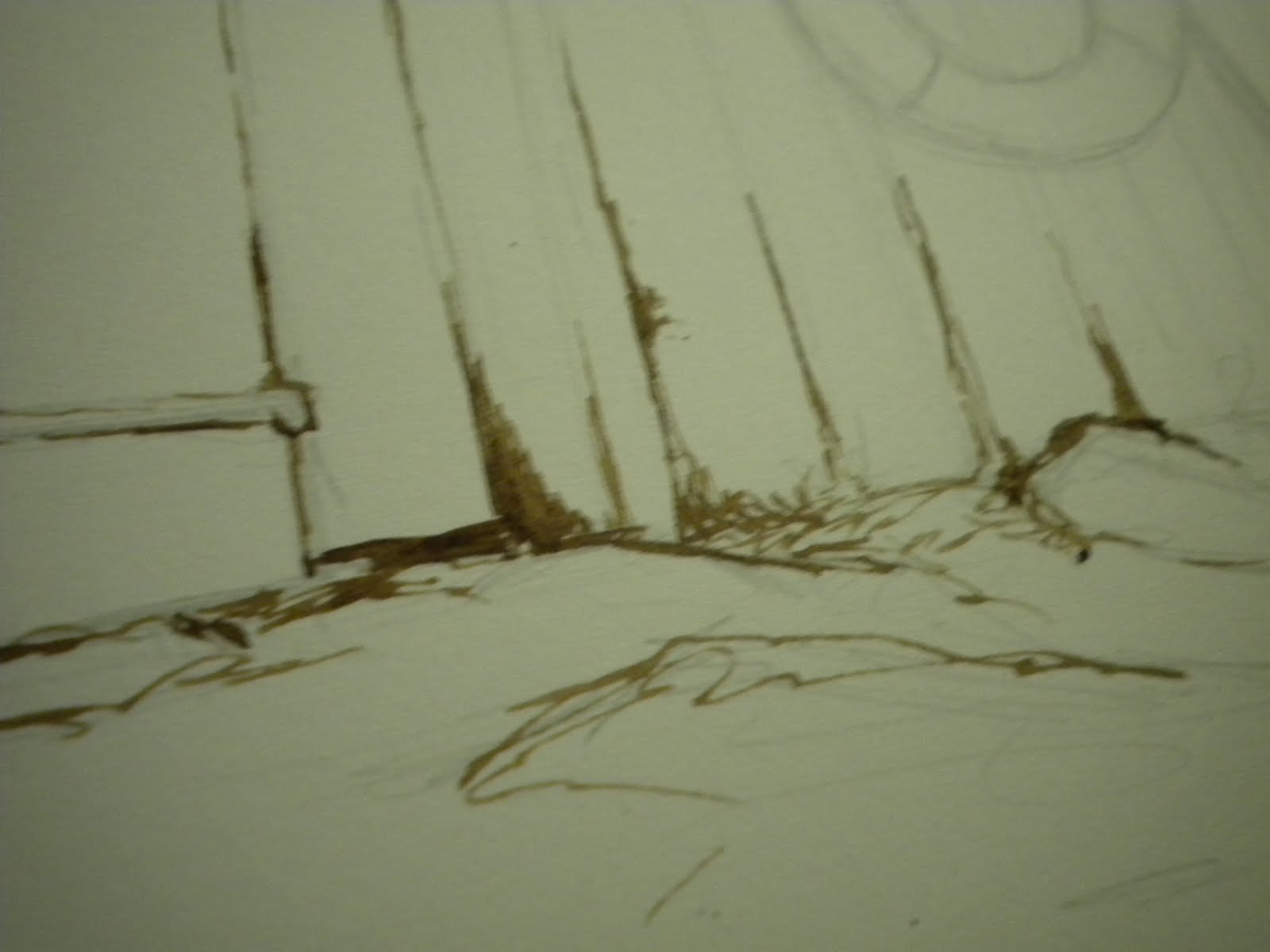
A twisty tree that was in the backyard of the house. The day we didn't go out, I sat and painted or doodled for most of the day and this was my favorite thing that came out of that day. I've used this illustration on a few products on my store.


Pemaquid Beach. The sun was out and right in front of my eyes, I had the Atlantic Ocean! It was amazing. This was my favorite day of painting, for sure. I don't think my painting looks that great, but whenever I look at it, I think of that day and all the great memories. This wasn't even the first time I saw the Ocean, but it was the best way I saw it (every other day was foggy and rainy), so I will never forget this.


I collected a lot of shells, stones and sea glass from the various beaches we visited and one evening back at the house, I decided I wanted to illustrate them and make icons. These shells and the starfish are also featured on products in my store.


Bubbles the Lobster. I think that was what we named him in the end. Some people wanted to name him Rocky the Rock Lobster, but he wasn't a Rock Lobster, so I think Bubbles was the winner. He got that name because as he sat on the table while we painted him (minutes before he was to meet his doom in a boiling pot of water), he had bubbles coming out of his mouth. It's sad because he was suffocating, but the name stuck, I guess. Another casualty of the trip, but it was for the best. RIP Bubbles, as well.


 This was one of the few I did on our "island" at Popham Beach. This turned out the best. The awful scan really doesn't do it justice...and the painting doesn't do the view justice. I told you I'm not good at seascapes. But as far as views go, this was one of the best. It was absolutely breathtaking. Crashing waves, rocky cliffs, grey-blue ocean, cloudy sky. I never thought I'd get to see something like that in my life. It was incredible. And it was really, really cold!

Saturday, June 4, 2011

Starting Over

So, remember that piece that I was working on in my last post...well, I wasn't completely pleased with how it was turning out, so I decided to start it over. The paper I was working on was too big and just wrong, and I wasn't feeling good about it. When I looked at the piece and then looked at the photograph, I just wasn't feeling it. It didn't have the right emotion to me. And it felt a little forced. Of course, these all could just be my perfectionist tendencies coming through, but I felt the painting was headed in the wrong direction, so I started it over again.

I had mentioned that I was having trouble getting back into rendered paintings because I hadn't done them in a while. I think the main problem for me in that painting was I hadn't drawn out in pencil all the forms correctly, looking at them closely, studying them. So I started over, on my small hot press block. This time, I looked at each form closely and drew it out in pencil, but was careful not to make it look too mechanical. One of the things about my work, is that I don't want it to look like I drew the lines with a ruler.
It may not be important for everyone to draw out every little detail when they start a painting, but it was for me for this because I wanted to get it right. Not hyper-realistic right, but I didn't want the painting to lack anything, even though it is small. I want this to be, like, this precious little painting because the memories I have of Maine are precious. If that makes any sense whatsoever.

Then I made a decision to use Walnut ink in this piece. The last time I used Walnut in was in Watercolor 202 last Fall semester. I have no clue why I haven't used it since. It is wonderful. It gives kind of an antiqued look to a painting and is remarkable (as I realized when I did my Briar Rose piece) for rendering woodgrain! Well, what is more woodgrainy than an old wooden barn in Maine?
And of course, I do plan to go over this with water and paint once I am done inking. I like how it is turning out so far.

Let me know what you all think.